
How to ACTUALLY make a seamless Instagram grid header (2026)
Meta’s constant changes are my villain origin story. Many articles and templates out there are WRONG WRONG WRONG now, including Canva. D'oh!


Okay. So. I know this post is VERY specific, but it was born out of pure frustration and the hope that it helps even just one fellow author or book influencer avoid wanting to fling their laptop, phone, and all their earthly possessions into the sea.
I spent hours creating a seamless Instagram grid header to call for ARC readers over the next two months (here’s a link to the form btw). According to Canva, the dimensions for an Instagram post are 1080 x 1350px. And most (all?) of the guides and templates I found for creating seamless carousel banners recommend 3240 x 1350px, which you split in three. So I built out my content with these dimensions, including carousel slides for all three posts.1
But then Instagram went and changed their grid dimensions AGAIN.2 Those 1080 x 1350px specs are correct for feed ads,3 and they look fine as organic posts in the feed itself, but the grid cuts off a gap on either side of each post. Since it only looks wonky in the grid, I didn’t realize until posting the second post.

Is this small misalignment the end of the world? Obviously not. But I’m a perfectionist, and this is meant to sit at the top of my profile for MONTHS. So dang it, I want it to look right!
The correct dimensions are as follows (as of August 2026):4
Single post (one static image or carousel): 1080 x 1440px
Carousel banner (which you then split in three): 3240 x 1440px
IMPORTANT NOTE: After I wrote this article, several authors on Threads told me 1080 x 1440px images still don’t work in their accounts. Instagram is an absolute MENACE rolling out their changes slowly, so these instructions might not work for you yet WEEEEEEE.5
In whichever tool you’re using to design your wide image, add guide lines to see where each of the three images end. In Canva, I went to File > Settings > Add Guides and Custom: 3 columns with a 0px gap.
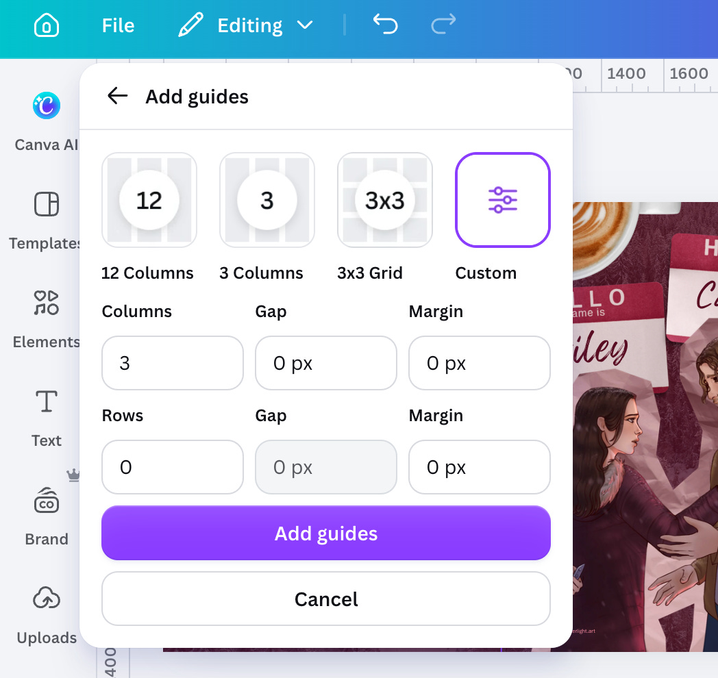
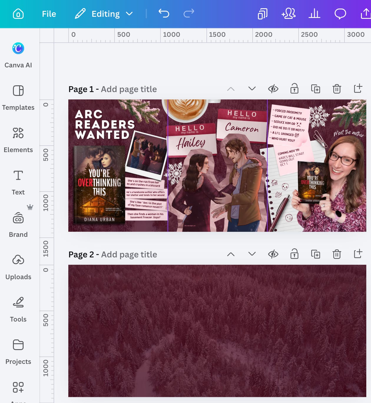
Voila! I also isolated just the background so I could split that image in three and use those as backgrounds within each individual carousel. I downloaded these as PNGs.
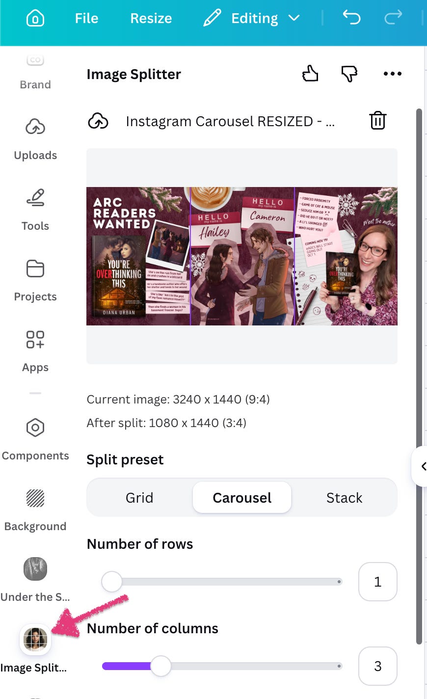
Next, I used the Canva app called “Image Splitter” to split each into 3 columns:
I then imported these individual images and created a new Canva project (1080 x 1440px) for each image within each carousel.
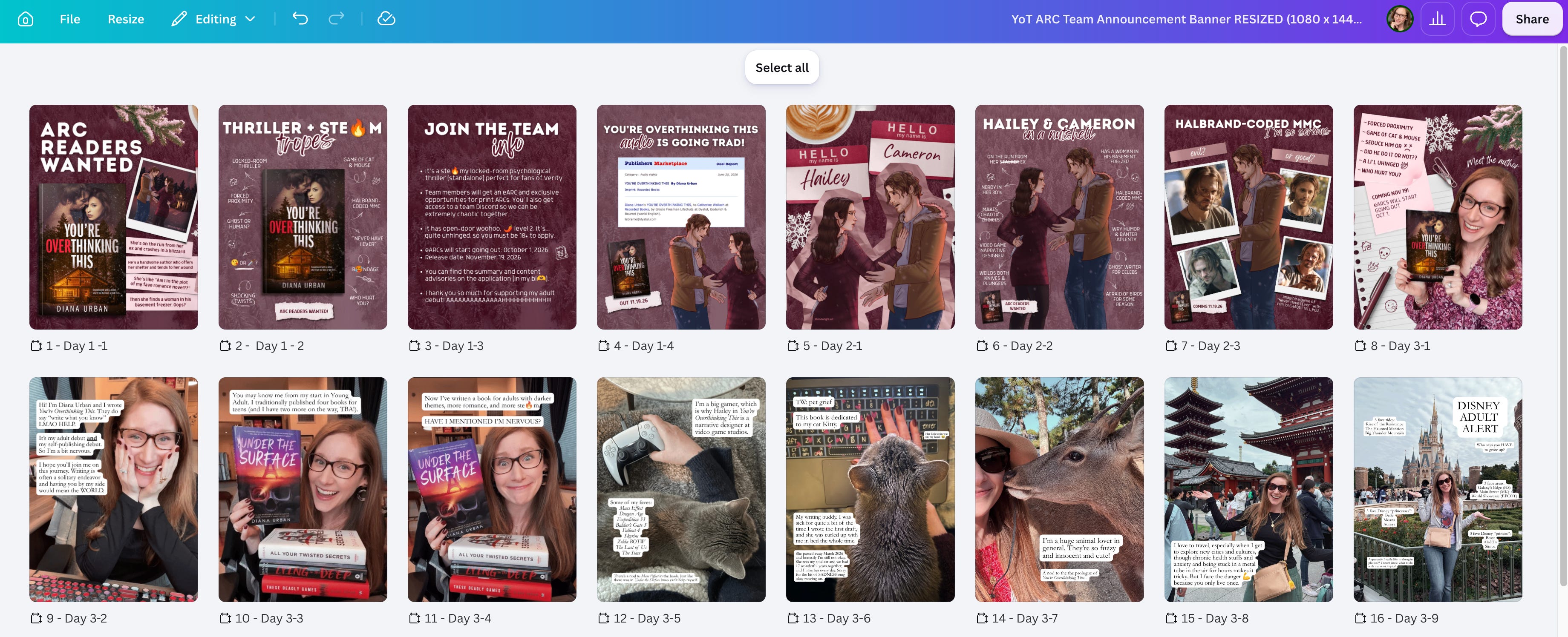
Now the banner at the top of my grid looks all pretty.
But at what cost? I archived my original two posts (which were getting great comments and shares) to replace them with the correct dimensions. Months ago this would have been fine, but now Instagram recognizes duplicate content and suppresses it,6 so I’ve lost all my social proof on the first two posts. Phooey! But after all the time I spent making these, there was no way I was going to start fresh with brand new designs. I HAVE TO WRITE.
Anyway, that’s why I’m posting this, so YOU can avoid this situation and get it right from the jump. I hope it helps.
This will probably be outdated in like two months lmaoooooooooooo.7

Because the algorithm apparently hates single-image static posts now. *yeets entire internet into deep space*
See “important note.” Also, didn’t they JUST change the grid dimensions from squares last year? I can’t even find an official announcement; they just sneakily changed the max height to 1440 in their documentation (someone please correct me if I’m wrong here). Some social media experts are saying the algorithm is now prioritizing posts that use this max height but not even all users have it yet?? *hurls the earth into the sun where it’ll eventually wind up anyway*
FOR NOW lmao
Oh my God I just unintentionally did that thing recipe bloggers do where they share their grandma’s entire life story before listing the ingredients for her famous blueberry pie I’M SO SORRY.
If nothing else I hope this post is entertaining for the comedy???
The joke I want to make here is far too morbid so I will restrain myself.
Help.